Brief -
A large financial services company wants to transition their current employee user-base to a new system that’s easier to learn and use. They also want to consolidate different user groups and processes into one system to streamline workflows. What features can be improved in order to reduce the complexity of the system and speed up record processing?
Team
Project Length: 18 Months
Bradley Griffin - UX Designer
Sarah Askey - UX Designer
Beck Johnson - Front-end Developer
Won Kim - Back-end Developer
Project Background -
The user-base is currently using multiple bloated, 20-year-old systems for processing their account’s purchase and sales of trades. Their process requires a lot of individual knowledge on how to do things because of the complexity of the system. The accounts trade in upwards of a couple million dollars, so there’s a lot of risk associated with matching and updating records. Much of that work is left to a select few users which causes a bottleneck in record processing. While the user-base isn’t large (roughly 40 users globally), there’s a big learning curve to start using the system which means new users struggle to do half of the processes that veteran users do.
Process & Discovery -
Working with a remote user group required our research to be limited to online tools like workshopping in Miro and user-testing within Webex. To start discovery on how users are currently navigating the system, we used an experience map on a specific process to capture the pain/gain points at certain steps. This allowed us to find exact places within their current system that caused them to slow their process. Workshopping virtually gave us the added benefit of seeing how they interact with the system via screen share. We were not only able to capture qualitative data but also the areas in which they were challenged by the the UI itself; noting parts of the system that they struggled with but had found work-arounds.
Experience Journey Map in Miro
Simplified Site Map
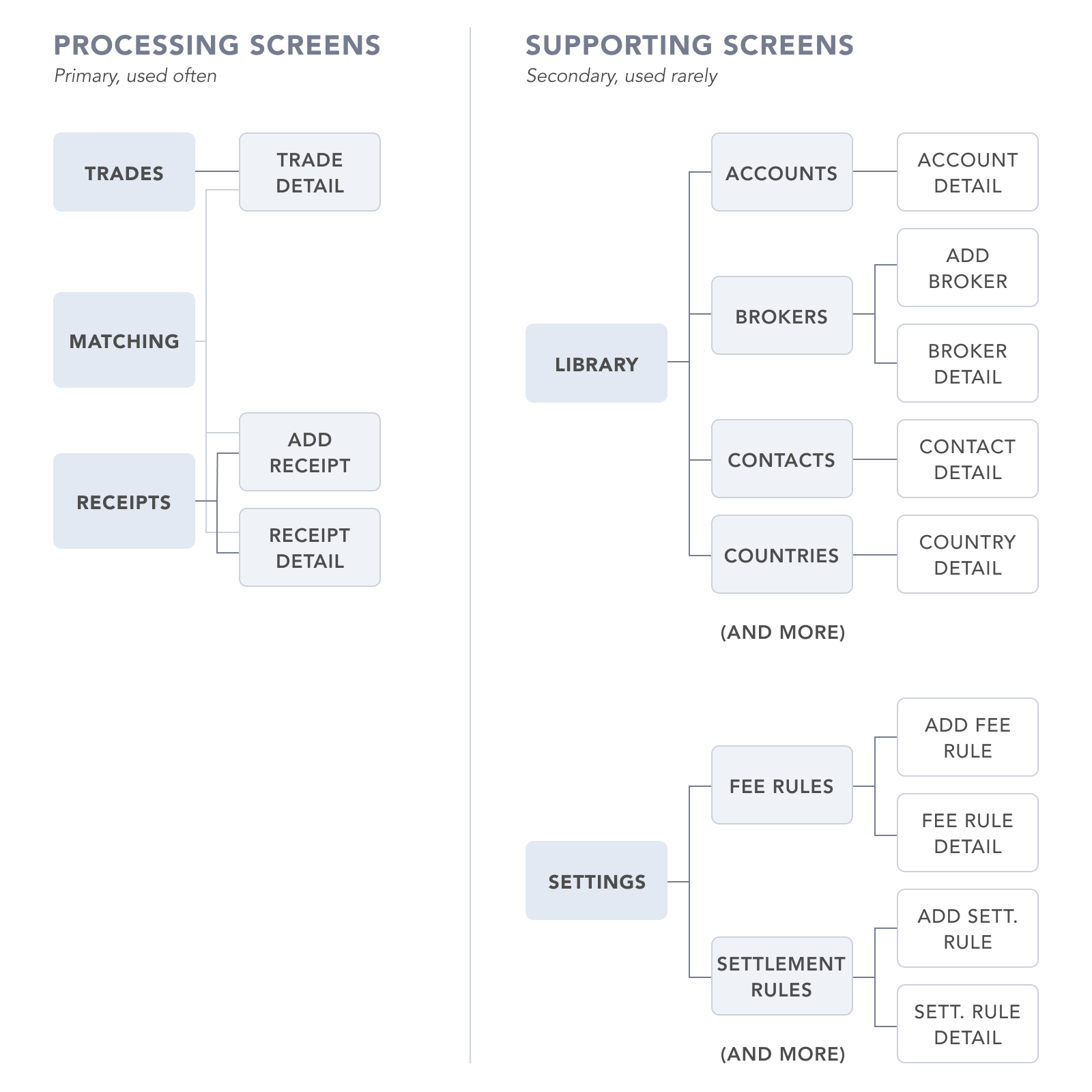
Learning how they interacted with the system wasn’t enough alone, we’d need to also understand how each process flowed into each other as many of them had downstream affects. We worked alongside the BAs to gather requirements from the users for each process in their current system. This not only gave us insight into how complex some processes are, but it also acted as a way for us to better understand how each process flowed into another. From these sessions we started to see the bigger picture of how a trade flowed through the system and each attribute that influenced how it processed. This work was crucial for our designs on upcoming features as it allowed us to proactively accommodate the needs of future flows.
Because we were so close to requirements capturing and hearing commentary first-hand from the users, we were able to more effectively produce designs. Our relationship with the users gave us an invaluable source to validate ideas and designs quickly, which was a necessity given the tight timeline for some features. Once we had an idea validated we then worked alongside the devs to check feasibility, pivoting or updating if necessary.
The nature of the project required us to have our design process intertwined with much of the team, but it worked to our advantage as it gave us more opportunities to check understanding with the different subject-matter experts. It also allowed us to advocate for the user at every step of the process, which ensured that their needs were at the front of most decisions.
Component Library -
Working on a tight timeline, we needed a way to quickly produce high-fidelity designs after validating ideas with the users. To accomplish this we created a UI Kit that we could pull from to reuse similar components thus shortening the time it takes to create a process flow. In addition to increasing our design velocity, it also helped us stay consistent across dozens of design files and features. The development time was also able to be cut down since they could reuse previously built components. Creating and maintaining the UI Kit front-loaded our work but lead to a decrease in design and development time later in the project.
Some of the components from our UI KIT
Testing -
Usability Testing Notes
To make sure the designs not only fulfilled the needs of the users but were usable as well, we gathered a new set of users with a range of experience to test our designs . Through our series of testing we hoped to find any issues with how we structured the navigation or page hierarchy. For each user we would test a set of eight scenarios while recording their screen and having them talk through their understanding. We would open the testing by allowing them to click around and get their bearings, calling out any thoughts they had. Once they were ready, we started going through the list of scenarios with specific tasks for them to complete or data to reference. The outcomes of the testing scenarios ultimately highlighted some issues that weren’t previously apparent. Our designs were also affirmed through each successful completion of the scenarios through user feedback and observational data. Testing our designs early gave us the opportunity to fix any mistakes in the design patterns and flows so that we wouldn’t carry them going forward.
High Fidelity -


